What’s a branding board and why do you need one?
A branding board, simply put, is the visual backbone to a company brand. It keeps the company designs consistant so that when people look at the companies business card, website, social media pages, documents… they all feel like they’re coming from the same company.
What should be included in a branding board?
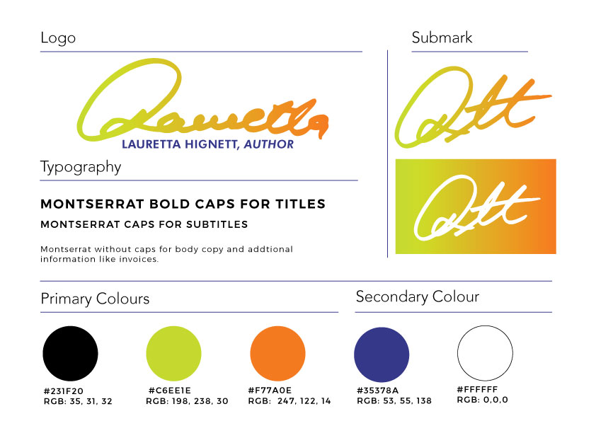
A branding board should include:
- Logo (logo layout if varying)
- Submark (stay tuned for “What is a submark?”)
- Colours with hex codes (In design geek terms, this is usually a sequence of numbers that represent a colour. For example: #debd2c, translates to a rich dark yellow)
- Fonts used in 3 styles (headings, subheadings and copy)
- Patterns (if applicable)
Why should every designer should be providing a branding board to their client?
Two reasons:
- It allows the client to pass that on to any designer/web designer, providing them with all the details they need to create design and web elements that feel like they belong to the companies branding style.
- It helps the client have a guide when creating their own content, even if it’s as simple as putting type into a box with colour, the type and colour will again, be fit the companies branding style.
What’s the take away?
Consistency is super important when people interact with a brand. If I go to your website and it’s all red, then I go to your social media page and I see all pink, and then I see the business card is blue, I’m going to think “Um, this is weird? Is this even the same company?”
Basically, you want to avoid varying shades of colour, bold font when it should be italic, or right alignment when it should be left. All these inconstancies that scream “We threw this together, but hey! Promise we have a good product!”
Can I see an example of this?
Sure can 🙂

