This blog post is brought to you by Claire from Crunchy Social, a big thanks to her!
If you have just started using social media as a marketing tool, you might have the idea that a few posts, blog content and a good number of followers and likes will take your business to the next level. The truth is, it takes serious marketing, planning and dedication to get your brand recognised, let alone liked by audiences.
A few nights ago, I went to an event that was all about Social Media and the connections you can, and should, be making there. It was presented by The League of Extraordinary Women – a group that support female-led businesses through hosted events. The guest was Emma Abrahams from Heart of Bone. She’s killing it in her industry with her unique style of what can only be described as badass jewellery.
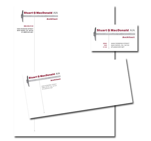
A logo is a company name in full with design elements. For whatever reason, there’s a real bummer of an idea floating around that once you have a logo, you’re all set and off you go, putting it on everything. An example of this can be seen here:
Yes, the company name is there, that’s great, but this is what sets apart having a logo and having branding. A logo alone is only the tip of the iceberg to full branding. It’s the everything else that creates the story for clients and the people interacting with your company. People want to see the care you have in your company and that you believe it in it!
You also see logo slapping when people who may have accidentally (Read: ignorantly) used one of those sites that are slowly destroying the creative industry…um *cough*99Designs, etc*cough*… A company will walk away with their new (sometimes copyright infringed) logo and start putting it on everything thinking that’s good enough.
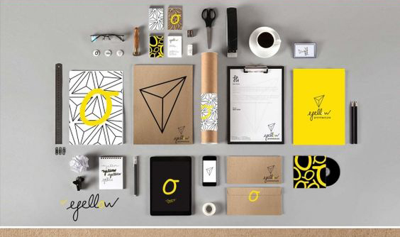
I’m here to tell you, it’s not. Logo Slapping looks lazy. But BRANDING… adding patterns, submarks, consideration to the type, playing with colours angles (this is where your branding board is handy)… that makes a company look exciting and interesting! That’s the kind of company people are going to remember. So, if you’re thinking you’d like your logo on mugs, pens, card holders, notebooks, business cards, etc. think about how it will look as a group. Do they look like cousins, or do they look like twins? You want cousins.
Here’s a really great example of a brand that’s playing with colours, patterns, their logo, angles, fonts, but you can feel it’s call coming from the same company. Cousins, not twins 🙂