This blog post is brought to you by Claire from Crunchy Social, a big thanks to her!
If you have just started using social media as a marketing tool, you might have the idea that a few posts, blog content and a good number of followers and likes will take your business to the next level. The truth is, it takes serious marketing, planning and dedication to get your brand recognised, let alone liked by audiences.
A couple of weeks ago I went to a seminar on content marketing, hosted by weteachme, as part of their WeTeachMe Masters Series. Before I get into that I’d like to praise the two women who spoke- Beatrix Cole and Ophelie Lachat. I’ve been to A LOT of events and it’s rare to find speakers so well informed, engaging and non-repetitive. I received an overwhelming amount of information in the two hours, which was a testament to these women and their knowledge. So, hats off to them! And hats off to We Teach Me for sourcing them.
A few nights ago, I went to an event that was all about Social Media and the connections you can, and should, be making there. It was presented by The League of Extraordinary Women – a group that support female-led businesses through hosted events. The guest was Emma Abrahams from Heart of Bone. She’s killing it in her industry with her unique style of what can only be described as badass jewellery.
As promised, I’m going to give you some tips on what to look for when you’re signing up with a designer, specifically focusing on the contract.
Rule number one: HAVE A CONTRACT. I can’t emphasize this enough. It doesn’t matter if they’re friends, families, or weekend lovers, whoever they are, contract it up. And beware of things like “Per my T&C’s which can be found on my website.” It’s DEFINITELY worth the 30 seconds it takes to dig your computer out of your bag and have a look.
It’s been brought to my attention that I attend a lot of events.
I can’t deny, it’s true. So why do I do it? For the networking (wOOohoOOo NeTwooorKinG *said in ghostly voice*), to learn new stuff, and getting ideas.
Let me start by saying that I get it, it seems unusual that a graphic designer would be writing about anxiety, but I wanted to write blog posts that relate to my new greeting cards and what inspired me to create them. In this particular post, it’s about my experience with Anxiety and my tips on helping someone who is coping with it.
Anxiety can be confusing for someone who hasn’t experienced it themselves. So, you may not know what’s appropriate to say or do. I don’t have all the answers, but what I do have is experience. Here are the six things I would have wanted people in my life to have said or done for me when I was going through intense anxiety.
Let me start by saying, there is no hard and fast rule to what design should or shouldn’t cost, other than not a $100. There are LOADS of things that factor in… so let me break the ones down that I see come up often:
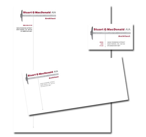
A logo is a company name in full with design elements. For whatever reason, there’s a real bummer of an idea floating around that once you have a logo, you’re all set and off you go, putting it on everything. An example of this can be seen here:
Yes, the company name is there, that’s great, but this is what sets apart having a logo and having branding. A logo alone is only the tip of the iceberg to full branding. It’s the everything else that creates the story for clients and the people interacting with your company. People want to see the care you have in your company and that you believe it in it!
You also see logo slapping when people who may have accidentally (Read: ignorantly) used one of those sites that are slowly destroying the creative industry…um *cough*99Designs, etc*cough*… A company will walk away with their new (sometimes copyright infringed) logo and start putting it on everything thinking that’s good enough.
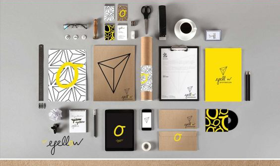
I’m here to tell you, it’s not. Logo Slapping looks lazy. But BRANDING… adding patterns, submarks, consideration to the type, playing with colours angles (this is where your branding board is handy)… that makes a company look exciting and interesting! That’s the kind of company people are going to remember. So, if you’re thinking you’d like your logo on mugs, pens, card holders, notebooks, business cards, etc. think about how it will look as a group. Do they look like cousins, or do they look like twins? You want cousins.
Here’s a really great example of a brand that’s playing with colours, patterns, their logo, angles, fonts, but you can feel it’s call coming from the same company. Cousins, not twins 🙂
The word “submark” is something designers and people in the design industry use to describe a smaller icon that pairs with your logo. So, for example your company is called “Bearly There:Bikini’s for Bears.” because you live in Alaska, and bears want to get their beach on too.
Your logo for Bearly There is the word Bearly There written out in these chubby scrolled letters, “Bikini’s for Bears” is small beneath it, and there’s an illustration of a bear in a bikini leaning on the B in “Bearly.” Can you picture it?? Haha, ok a little abstract, but rather than showing allll that logo, your submark, would be the bear in the bikini.
A straight forward example is McDonalds. The Golden Archs…”M,” that’s a prime example of a company that can use just their submark of the “M” and people know straight away what the company is. Bearly There, hopes to one day be like McDonalds, where people will see the bear in a bikini illustration and straight away think “Bearly There.” That’s one way to know when your companies really MADE IT. When people recognise a company by their submark.
When would I use a submark?
Submarks are great for social media icons, email signatures, an element to use on your business card, and any where else you want people to think of your brand, but don’t have a lot of space to show the whole logo. FB for example gives you only a tiny box as your icon. Not a lot’s going to fit there, so you’re going to use the bear in a bikini by itself, rather than the bear in a bikini, with all the whole logo name.
Do I always need a submark?
Nope, you can definitely function fine without one. Look at FORD for example (the car company). The name is short enough that an icon isn’t necessary. If your company name is short enough, or if it makes a nice “type lock up” (stacks well), then a submark isn’t always necessary.
How can my submark feel apart of my brand?
Easy ways to connect your submark to your brand are colour and/or font. If Bearly There‘s colours are brown and tan, and the bear illustration is brown with a tan bikini, people will make the connection. McDonald’s, in the earlier days, their logo was written out with the “M” paired with the name, in the iconic yellow and red, and over time they just pulled the “M” out from the rest of the name and bam! Submark 4 eva! But that works too. Your submark can be just the first letters in your company name written in the same font or in your brand colours. People will easily make the connection thanks to companies like McDonalds who have been doing it for decades.
Example of ways Hardcopy Cartel has created submarks for brands:
You might be thinking “sure I know what that is, it’s the thing that goes at the end of an email, simple.” and basically you’d be right. An email signature is how you sign off your emails. It can easily be set up to automatically be attached to the end of an email. What you might not know, is there is a wrong way to create one and a right way.
THE WRONG WAYS:
The Least Wrong Way:
Sometimes you’ll see a name, contact number, and web address that’s blue and underlined to indicate it’s a link. Simple enough, but not that interesting. It doesn’t have a logo, doesn’t look that appealing and it doesn’t really attract people to find out more. It does the job though!
The Most Wrong Way:
It might not seem like it, but the worst thing you could do, is have an amazingly designed email signature and then save it as a .png or a .jpg and use that. This might be what a designer does, especially if they are less experienced or from say, a website that does it on the cheap… *Cough, 99Designs/Fiverr, cough* The problem with this is that when you send an email with a .png or .jpg the person receiving the email will see either a blank box or get the email signature as an attachment. It may look beautiful, but it’s not really doing a whole lot for the business. It’s actually just a pain or confusing for the person receiving the email.
THE RIGHT WAY:
The right way is more time consuming for a designer and includes a different skill set. To make a proper, functioning… and I when I say functioning I mean you can click on a website that’s NOT underlined and blue, you can click on social media icons, there’s a logo that’s not an attachment… it needs to be coded in HTML. What’s HTML? HTML, is coding that you would normally associate with websites. Doing it this way, the links like social media and your logo are actually “hosted” online. Meaning, they live in the internet, so they aren’t just an image any more.
It gets more complicated from here, but if you’re a new designer or you’re working with a designer who wants to send you .png for your email signature, ask them about making it into HTML. They may even be happy to do it because they’ll then be learning something new for next time. Keep in mind though, your designs are more limited when you design with HTML, but it’s better to have a basic linkable email signature, than a blank box.